Professional home décor ideas
Ever flicked through a magazine or watched a TV show with flawless looking interiors wondering how on earth you might pull off something similar yourself?
It’s actually easier than you think! I have styled rooms for TV shows, magazines, books, adverts and there are some tricks of the trade that us designers and stylists use time and time again. Listed below are my all time favourites:
Get reflective
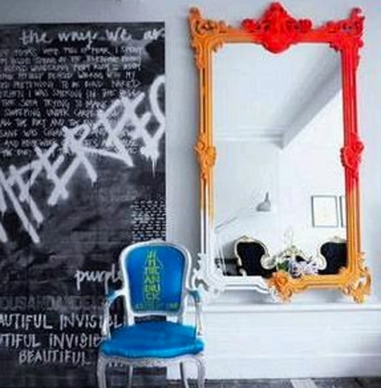
Add mirrors. Mirrors are a designer’s best friend as they expand horizons and add depth and intrigue. I tend to super size all of mine as it adds that element of grandeur but you absolutely don’t have to. Mirrors are perfect for almost any room, from over a mantle to an alcove, from the end of the hallway to outside. The most important thing to remember when decorating with mirrors is to make sure you are always reflecting something back at you, not just a blank wall. I am a big fan of convex mirrors, the ones that bulge out like a fish eye. As convex reflect light outward, the images they produce are distorted so it might not be a good mirror for grooming but it’s a fabulous decorative piece. I especially love them in living rooms or dining rooms because convex mirrors make objects look smaller. They are able to reflect a larger area than a flat mirror, making your space look super magical!
Little tables
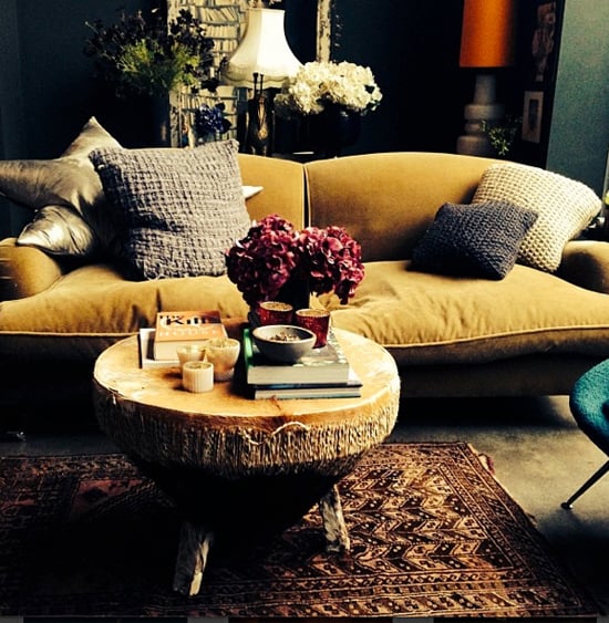
Add little tables. Tucked or nestled by armchairs or sofas, or placed at the end of a bed or in a hallway, little tables help soften a room but at the very same time they give it vitality. Anywhere there is a chair or sofa in my house you’ll find a table. I, oddly enough, fashion all sorts of things into coffee tables from African drums (see image) to apple crates, stools, even poufs so you don’t have to necessarily go down the conventional coffee table route.
Talking of which, ignore all that mumbo jumbo about heights and dimensions when you are purchasing a table. The more you ditch the rules, the more intriguing a room becomes. Let’s take my bedroom as an example. I find bedside tables the most boring things on earth. They all look the same. It wasn’t until I found the most amazing occasional table which I put alongside the bed that I turned the room around. The table is way higher than your standard bedside but you know what, that is exactly what creates magic. If you can, opt for circular tables too as they will help your room out massively. Circles break up all the straight lines in linear or boxy rooms, so it’s one of the tricks that us people in the know use all the time!
Finishing touches
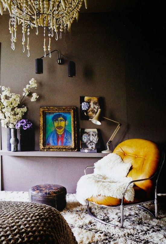
Finishing touches are the equivalent of a 5-minute facelift in the decorating world – they turn a room around from drab to fab in an instant. I’m talking pictures, cushions, vases, candles – accessories basically. If you don’t have enough in a room, I find that the space can look and feel like a shell, empty and unfinished. Having said that decorating a room with accessories is always a work in progress – it never finishes, which is the fun part right?
Plants and flowers
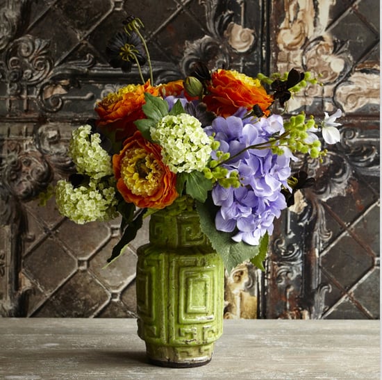
Plants and flowers should really go under finishing touches but because they are such an important category in their own right I wanted to talk about them separately for a second. They set off a coffee table, a bookshelf and a cabinet beautifully, adding life, colour and texture. I am a fan of both faux’s and real and I mix plants and flowers in rooms. For example, in my pad ferns hang out with roses, cacti with peonies and blossom – every nook has a bloom or plant on it!
Overdose on texture
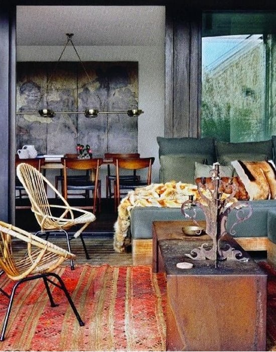
I often get shown images of spaces by clients who wonder why they don’t work and the answer is always the same. There is never enough texture. Texture adds immediate interest to a space and avoids it from becoming boring. The trick of course to is contrast your textures so for example if you have three cushions on a sofa you wouldn’t want them all of the same fabric. To up the visual interest you might want to mix leather with silk or wool for example.
When you start looking at each and every object, accessory or piece of furniture, you have to try and contrast the textures. You might not want to put a glass vase next to a shiny lacquered one on a shelf as there is too much shine going on. Try swapping around say the lacquer vase with a concrete one – now you’re talking! Texture adds dimension and although it might not seem obvious at first, it appeals to our senses, making spaces feel tactile and comforting.
Simple tricks that make all the difference in the world!
Happy Decorating.
Got a room that needs freshening up before you put our tips into practice? Speak to one of our registered painters or decorators to give your room a new lease of life.


I have a kitchen in an 18th Century room up a step from an old 17th Century kitchen which is now a family room. I put this kitchen in 30yrs ago. This room needs a better look. The original floor is fumed oak but not good. There is a very large space under it. A nuisance because I thought it would be good to carry through limestone flooring from the hall. Not good because it would move and I’m not having the huge space filled with concrete. Wood it will have to be.
I have an idea to build in a tall cupboard or walk in cupboard because I don’t anymore want to scrabble about for frying pans, saucepans, and other hanging things that are piled up in drawers and would like to set a different trend!! The kitchen has L shaped layout with huge ancient pine farmhouse table in centre. Not particularly sophisticated looking and I have horrible laminate on floor
ash units and white formica work top. You will get the picture. It’s about time I changed all that. I have tried sanding the original floor, varnishing it and I even tiled the floor with white tiles once. The old oak floor is really down well but I’m sure a good workman could get it all up. There is a central heating boiler in the fireplace with pipes on gravity feed going up the corner of the room. Big 18th Century frieze around top of walls.
Can you advise on this kitchen? It would make a fantastic library with a super leather chair or two but it has to be a kitchen. The huge utility room is the other side of the family room on the way to the garden.
Though I liked this, I was reading it for tips on how to make my painting, wallpaper hanging etc. look more professional.
Great advice. To the point. Now I know why I have done things in the past – without realizing why!
MANY THANKS